Template properties are unique properties of all components used in the template created in template editor. You can see the list of all template properties in the Preview > Live Preview popup.
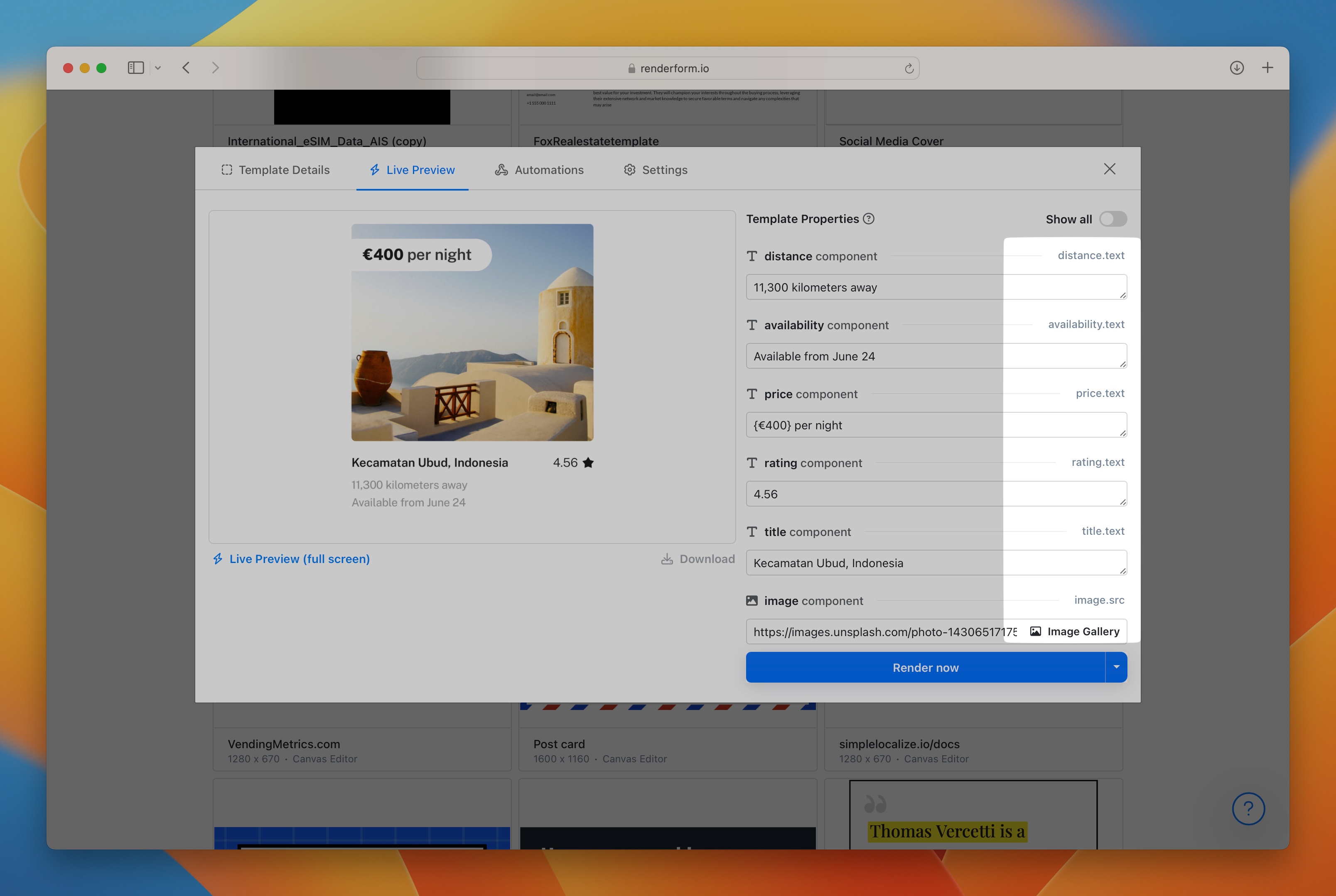
Template properties are the combination of component ids and component properties, for example:
my-image.src- image component with idmy-imageand propertysrcmy-image.width- image component with idmy-imageand propertywidthmy-text.text- text component with idmy-textand propertytext
What is a component?
A component is an object that can be added to a template in template editor. Every component can be modified using controls in the Inspector or via integration like REST API, Zapier or Make.com.
What are template properties?
Template properties are unique properties of all components. You can assign values to template properties to define how the component will look like, for example:
my-rect.color=rgba(255,255,255, 1)- makes a component white,my-rect.opacity=0.2- makes a component nearly visible,my-rect.opacity=0.0- makes a component invisible,my-rect.rotation=45- rotates a component by 45 degrees,my-text.text=Hello World- changes text of the Text component,my-image.src=https://example.com/my-image.png- changes an image source of the Image component,
Common component properties
These properties can be used with every component.
y- y position in pixelsx- x position in pixelsrotation- rotation in degrees 0 - 360opacity- opacity, eg:1,0,0.5
Render Component
The Render component is a unique type of component
which can be used to override template settings when you connect 3rd party integrations.
Use _render value as Component ID to adjust general render options,
for example: _render.fileName=MyFile to change the name of the rendered file.
Properties:
_render.downloadFileName- custom file name for rendered file that is used for saving and downloading files, file extension is added automatically, allowed characters:a-z,A-Z,0-9,-,_,.._render.fileName- custom file name for rendered file, it is used in the link to the rendered file, eg.:https://cdn.renderform.io/xyz/results/MY_FILE_NAME.jpg, file extension is added automatically, allowed characters:a-z,A-Z,0-9,-,_,..
Colors and gradients
Colors can be defined in different formats:
rgb(255,255,255)- white color,rgba(255,255,255, 1)- white color with full opacity,#ffffff- white color with full opacity,linear-gradient(rgba(255,255,255, 1), rgba(0,0,0, 1))- linear gradient from white to black, colors can be defined in any format,radial-gradient(rgba(255,255,255, 1), rgba(0,0,0, 1))- radial gradient from white to black, colors can be defined in any format.
Rectangle Component
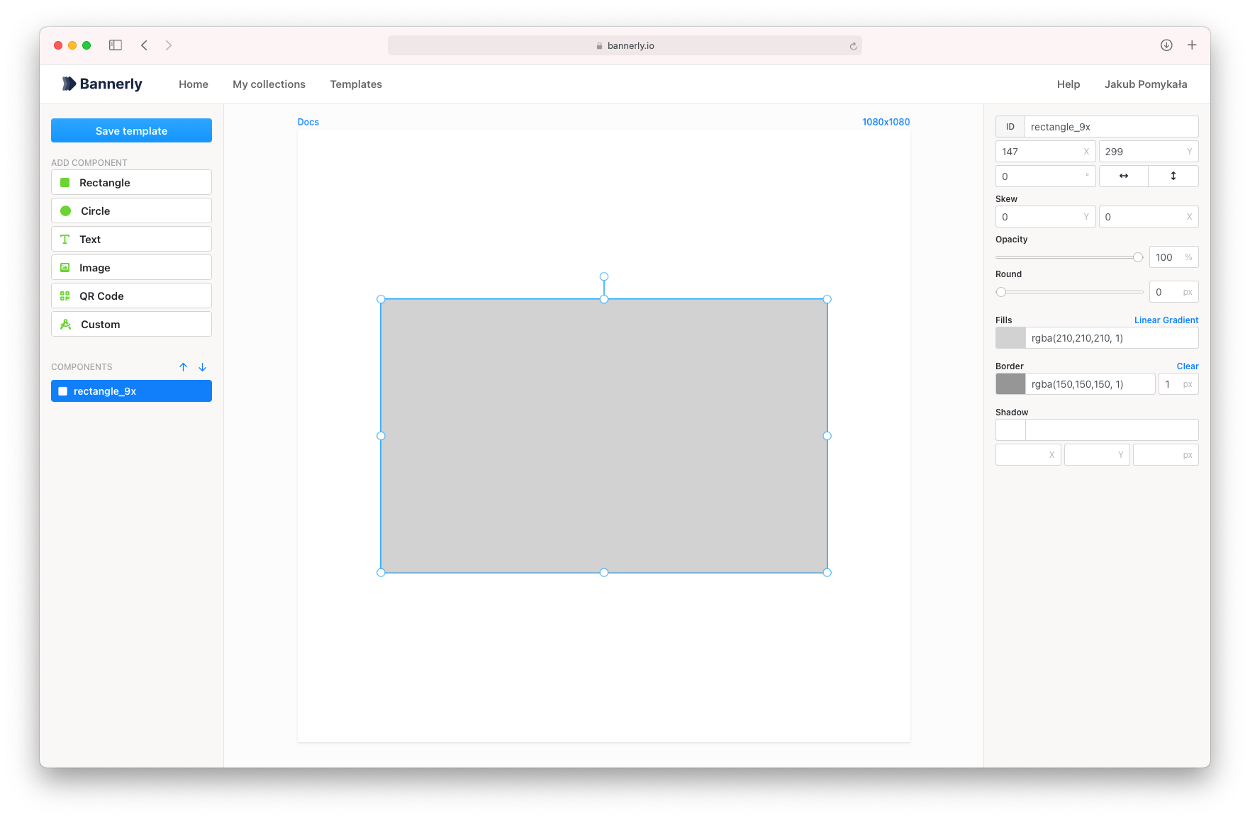
Properties:
color- rectangle fill color (eg:rgba(255,255,255, 1),#efefefor gradientlinear-gradient(rgba(255,255,255, 1), rgba(0,0,0, 1)),radial-gradient(rgba(255,255,255, 1), rgba(0,0,0, 1)))borderColor- rectangle stroke color (eg:rgba(255,255,255, 1)or#efefef)radius- rectangle radius of all corners
Circle Component
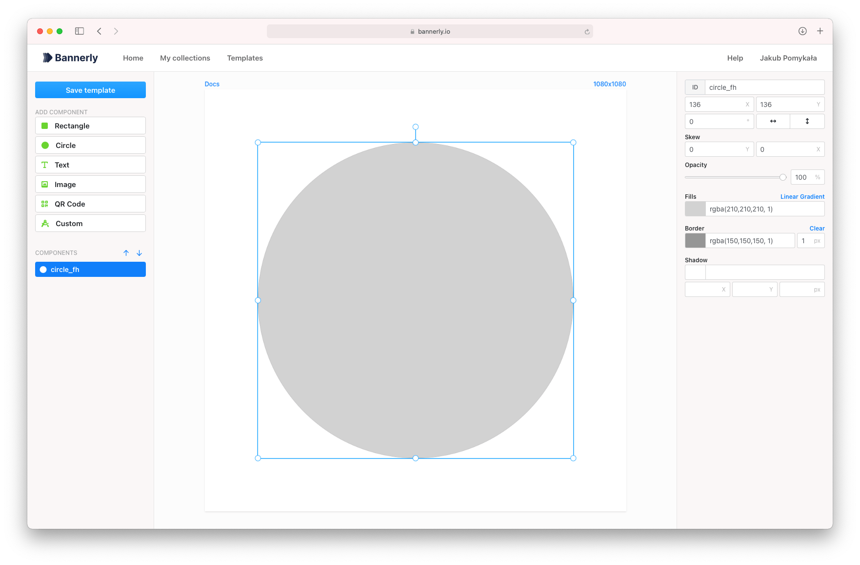
Properties:
color- circle fill color (eg:rgba(255,255,255, 1),#efefefor gradientlinear-gradient(rgba(255,255,255, 1), rgba(0,0,0, 1)),radial-gradient(rgba(255,255,255, 1), rgba(0,0,0, 1)))borderColor- circle stroke color (eg:rgba(255,255,255, 1)or#efefef)borderWidth- circle stroke width (eg:5)
Text Component
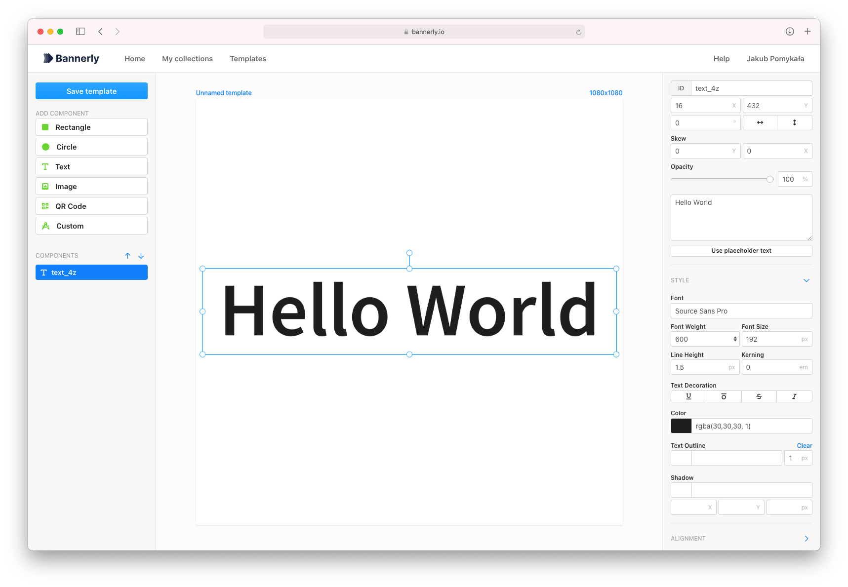
Properties:
text- text valuecolor- text color (eg:rgba(255,255,255, 1)or#efefef)fontWeight- text font weight (eg:600)fontFamily- text font family (eg:Lato)textBackgroundColor- text background color (eg:rgba(255,255,255, 1)or#efefef)textBackgroundRadius- text background radius of all corners, eg:5
If you used curly braces {} in the text, you can use also change the secondary properties:
secondaryColor- text secondary color (eg:rgba(255,255,255, 1)or#efefef)secondaryFontWeight- text secondary font weight (eg:600)secondaryFontFamily- text secondary font family (eg:Lato)secondaryTextBackgroundColor- text secondary background color (eg:rgba(255,255,255, 1)or#efefef)secondaryTextBackgroundRadius- text secondary background radius of all corners, eg:5
QR Code Component
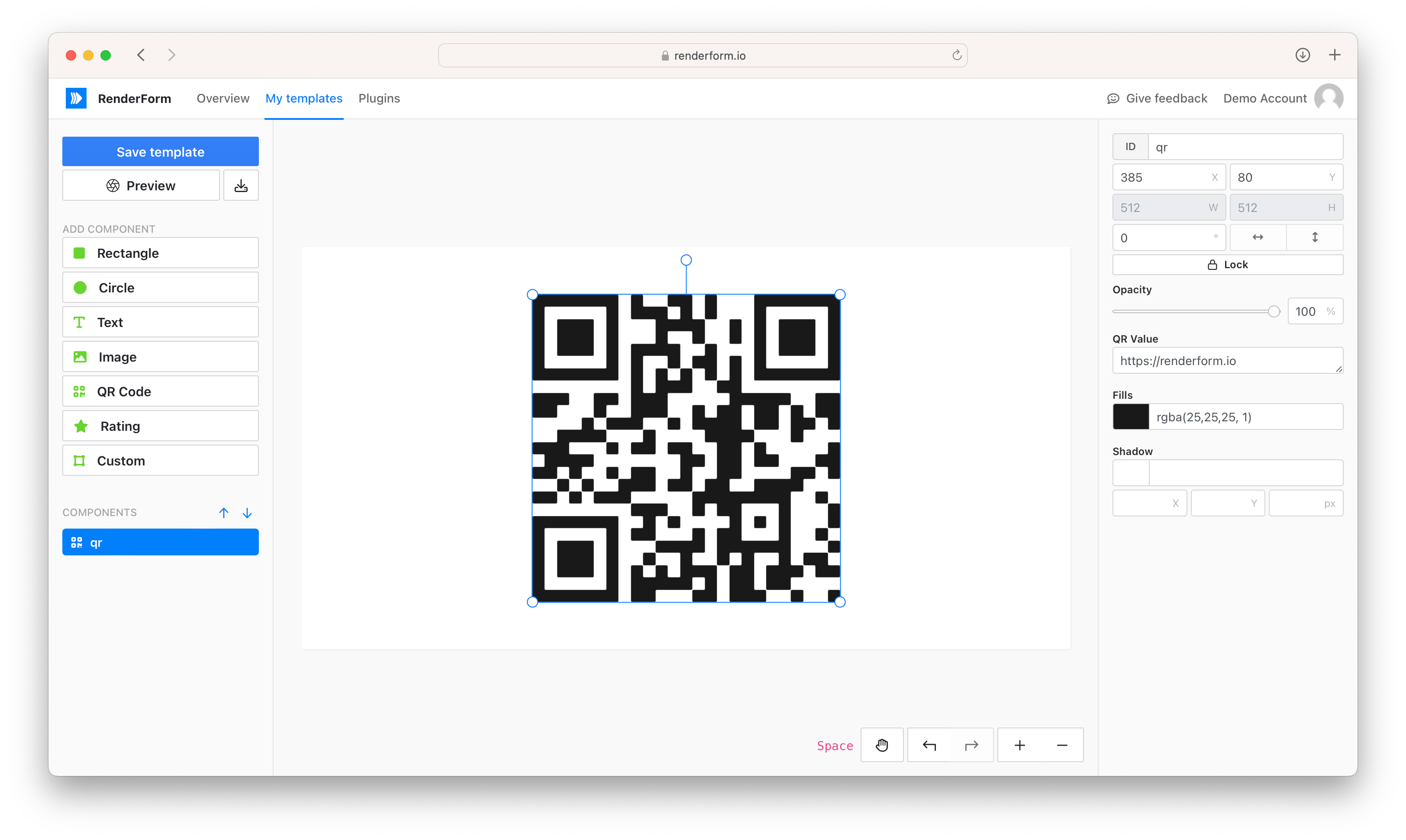
Properties:
value- QR code text, URL or anything else to encodecolor- QR code color, eg:rgba(255,255,255, 1)or#efefef
Image Component
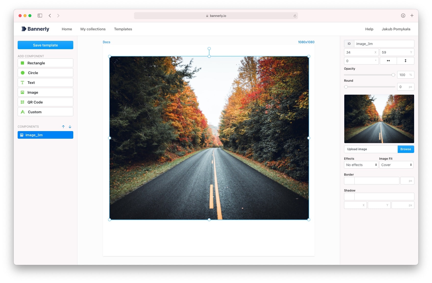
Properties:
src- image URL or base64,borderColor- border color, eg:rgba(255,255,255, 1)or#efefef,borderWidth- border width in pixels (eg:5)
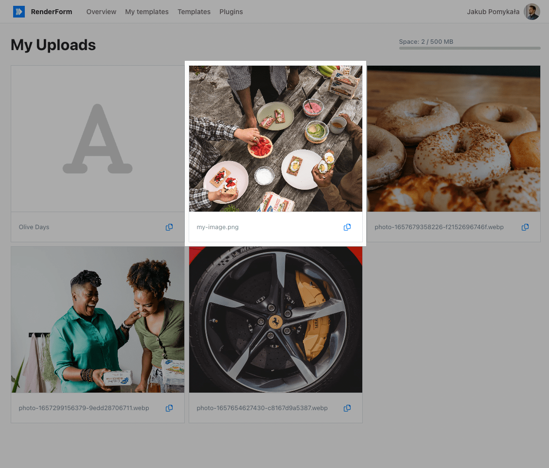
Tip: Re-use uploaded images
You can reuse already uploaded images by using media: prefix in src property. For example: media:my-image.png.
File names are always taken from original file names from your computer. The list of all your uploaded images can be found in My uploads.
Currently, there is no option to change image names.
Rating Component
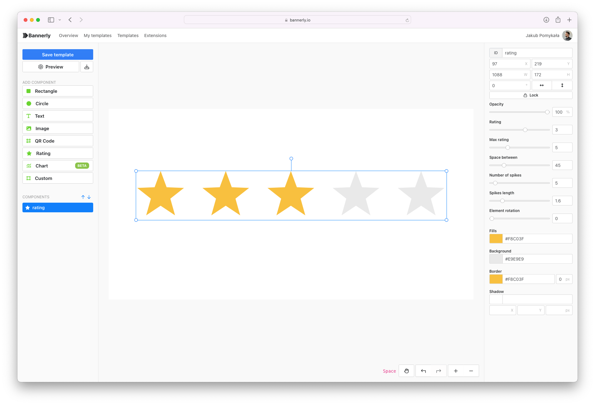
Properties:
value- active rating value
SVG Component
Properties:
color- SVG fill color (eg:rgba(255,255,255, 1)or#efefef)height- SVG height in pixels (eg:100)width- SVG width in pixels (eg:100)borderWidth- border width in pixels (eg:5)borderColor- border color (eg:rgba(255,255,255, 1)or#efefef)